Table of contents
You can view the retention rate of the selected application in more detail.
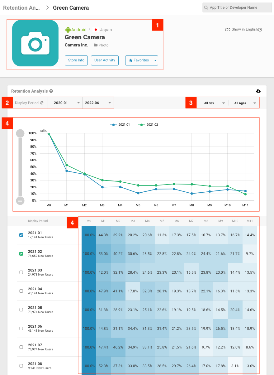
(Retention Analysis › selected app name)
Displays app name, developer, and app icon. Links to other pages such as Store Info and Usage Information. You may also add an app to your Favorite list.
You can select a specific period you wish to view. You can select the start date and end date from the Ref. Point (month).
Filters data based on user sex and age group.
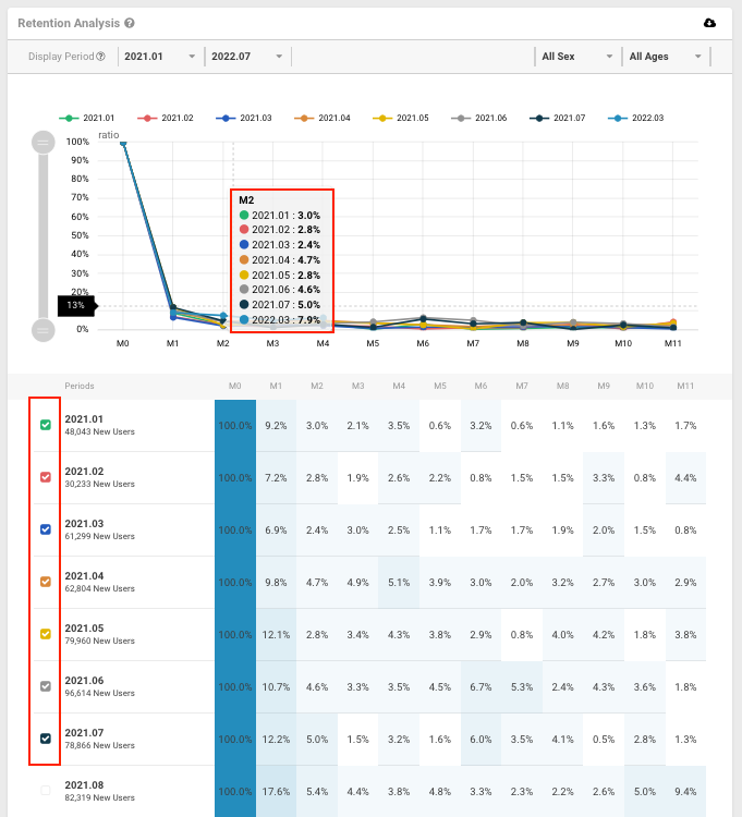
The line graphs allow you comparison of users acquired over different time periods to see if there are differences in retention rates. Hover over the line graphs for numerical values.
The darker the colour, the higher the percentage of users who return/continue to use your app. For example, game apps that regularly hold campaigns tend to have a high retention rate while medical apps tend to have a lower retention rate.
Each row represents the retention rate for a specific period in the cohort, with the bottom row representing the latest cohort and oldest ones on the top.
<aside> 📘 ※ Missing data may be due to numbers and values not meeting certain requirements needed to perform calculations. Such data will be displayed when requirements are met as a result of technical improvements.
※ Due to rounding errors, estimated values may not match the multiplication of ratio and user population.
※ The above data is calculated after having matched panel users with smartphone users distribution (in Japan) and multiplying a weight variable.
※ Currently, data since January 2021 are available on the dashboard.
</aside>
Next Article Retention Data Definition →